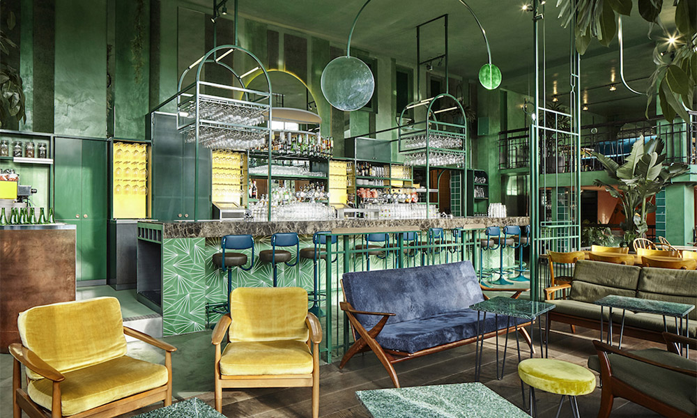
The speculations are over and Pantone finally announced the colour that will dethrone last year’s big hit Rose Quartz and Serenity. For 2017, Pantone chose a shade of a simple name – Greenery thus wanting to evoke the first day of spring, when everything is starting to bloom. The symbolic is clear – Greenery is for new beginnings – something we all need in 2017. Besides, it symbolises green lifestyles as well. So, if you’re thinking of renovating in the year to come, this is the shade you should implement and here’s how.
In the bedroom
If you ever saw the interior of a luxury hotel room, you might’ve noticed something you couldn’t see as much in private homes – luxuriously upholstered headboards. However, this is one of the biggest interior design trends for 2017 and a perfect place to use Pantone colour of the year. Consider reupholstering your headboard – opt for a soft material to make your bedroom cosy. Choose plush and you’ll make a combo of latest trends – Greenery, plush, and luxurious headboard. Make the linens white and finish off with a few green cushions – your bedroom will look amazing.
In the living room
The best thing about this green shade is that it can be used as wall paint, regardless of the size of the room. It’s dark enough to add depth to the walls yet bright enough to make the room appear bigger visually. Repaint your walls – you can even make them look a bit rustic to get that cabin look interior design experts adore while the rest of the furniture and carpeting should be brightly coloured. Play with different kinds of fabric but make sure you choose the colours right. For instance, if you want to calm the Greenery down, opt for pastel shades of purple, blue, or grey to get that fancy living room look.
In the home office/library
If you’re among the lucky ones to have a spare room in your house that you can turn into a home office or a library, congratulations. And if you’re not, don’t worry – there’s always a guest bedroom that can double as a home office or a little nook under the stairs to serve the purpose. Being in the centre of spectre, green is the colour of balance and it’s considered to be stress-relieving. That’s why green details in your little reading corner are a must – opt for green shelving and details on the rug to create space to both relaxing and motivational and inspiring, so you can work hard when needed. You can begin your search for office furniture to suit your colour scheme with https://www.officemonster.co.uk/, where they have a range of storage solutions, desks and chairs, amongst other office essentials.
In the kitchen
While there are a many ways to make your kitchen green metaphorically, it’s not a bad idea to make it green quite literally. For instance, you can paint the lower cabinets with Greenery. Leave the floor and countertops dark and upper cabinets white to create a stunning contrast resembling the colour scheme found in nature. As for the walls, tiles are evergreen but cork and terracotta are trending in the home décor right now so that might be your choice as well. They match with Greenery marvellously and will bring a warm, cosy ambience to your kitchen.
Keeping up with the latest interior design trends is not always easy. However, when experts make the trend so adorable, such as this Pantone shade of the year – it’s kind of hard to resist. The good news is that you don’t have to – it’s so versatile and easily adjustable to any home décor style. Make it the main colour or use it in the details – the choice is all yours.


